WordPressテーマ「Cocoon(コクーン)」で設定できるフッター左・中・右ウェジェットをモバイルでも表示する方法です。
前提
「フッター左・中・右ウェジェット」とは外観→ウェジェットの中にある、
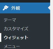
以下の3つのウェジェットのことです。
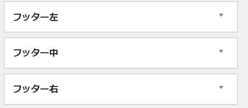
この3つのウェジェットは、PCなどでは表示されるが、モバイルでは非表示になる。
一応、モバイルで表示したいフッターは、その一つ下にある「フッター(モバイル用)」に入れればいいのだが、フッター左・中・右と同じものを表示したい場合は、2重管理になるので面倒なので、フッター左・中・右をモバイルでも表示するようにしたい。

やり方
子テーマのstyle.cssをいじる。
以下手順
1.外観→テーマファイルエディターを選択
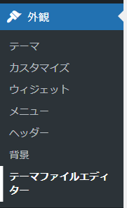
2.編集するテーマを「Cocoon Child」にする。

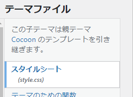
3.テーマファイルは「スタイルシート(style.css)」を選択
4.「/*834px以下*/」の条件のところに以下を追記する。
  /* モバイルでもフッターウェジェットを表示する */
  .footer-widgets {
    display: block;
  }
↓追記後
/*834px以下*/
@media screen and (max-width: 834px) {
  /*必要ならばここにコードを書く*/
  /* モバイルでもフッターウェジェットを表示する */
  .footer-widgets {
    display: block;
  }
}
これでモバイルでもフッター左・中・右ウェジェットに設定した内容が表示されます。
コメント